
Process Flow Visibility
A practical method for making work visible — where time is spent, where delays occur, where rework hides, and where risk accumulates. It works the same way on a vulnerability, a project, an access request, a recovery, an audit finding or a customer order; only the cost of the waiting changes.
How long does it take — and why does it take so long?
Before you buy more people, technology, or services — do you know how effectively your existing resources are being converted into outcomes?
PFV shows where an investment would actually improve capacity, flow, throughput or exposure — and where it would not.
Where this came from
Project planning, and first-of-a-kind implementations. Work where nobody can answer how long will this take because it has never been done here before, and where the honest answer is buried in dependencies nobody has written down. Throughout my career I was responsible for increasingly complex technologies, services and organisations, and I learned that I didn’t need to be the deepest technical expert in every area to lead effectively. What I needed was visibility.
Process mapping became my way of turning complexity into understanding, uncertainty into measurable facts, and dependence on expert opinion into informed leadership. Process mapping is the data collection mechanism; Process Flow Visibility is the visibility created from that data.
The method, end to end
SEE → MEASURE → IMPROVE → PROVE
See the process. Measure what is happening. Improve what matters. Prove that it worked.
Seven stages, one process at a time. Nothing here needs software until stage two, and nothing needs a data request at all.
- Start. How many items are open right now? How many finish in a week? Divide the first by the second — that is how long each one really takes. Does that cycle time work for the business? If it does, stop here. Do it on a napkin →
- Map one recurring process. For each step: the task, who performs it, the hands-on work, the waiting, whether that time is owned by an external team, and where work is sent back to an earlier step.
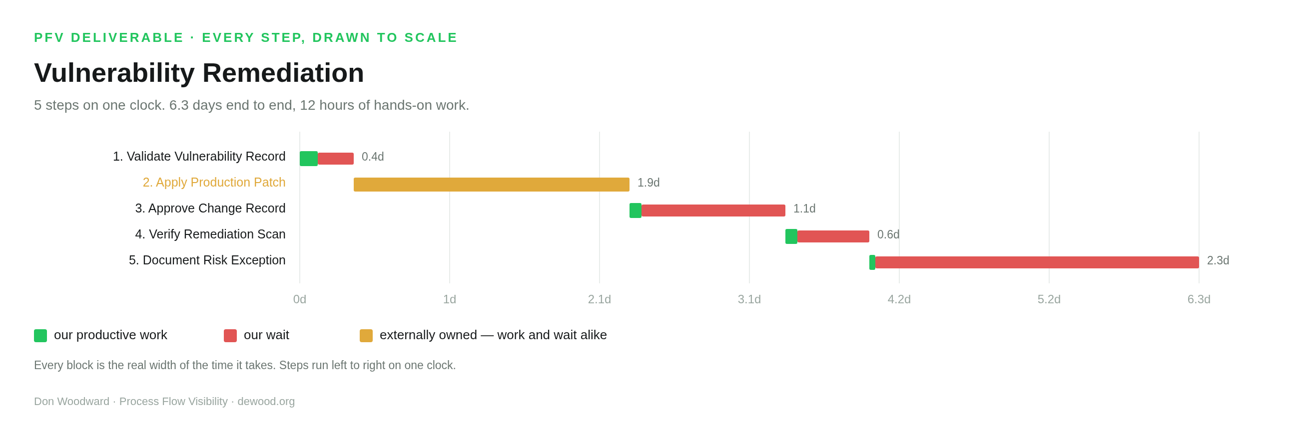
- See it as one timeline drawn to scale — green for work, red for waiting you control, yellow for work or waiting owned outside your organisation.
- Classify the waits — internal, external, required, or rework related.
- Diagnose where the largest controllable exposure sits, and why the work waits there.
- Improve one thing. Not five — one, so the next measurement can tell you whether it was the thing that worked. And not automatically the biggest wait: where the evidence supports it, PFV names the step that appears to limit the whole process and says what the rest of the process should do for it before anyone buys capacity.
- Prove it. Measure the same process again and compare it with the baseline: what changed, by how much, where the gains landed, and where anything got worse.
The biggest wait is not the constraint
A step can be slow, sit on the critical path, carry a long queue, send work back, or be run by someone else — and none of that makes it the thing limiting the process. Put more people on it and you may find the process finishes no more work than it did before.
Where the evidence converges — work queuing for that step in particular, plus rework returning to it, a position on the path that decides the finish date, or a real share of the hands-on work — PFV names it a likely constraint and gives the order to work in: get more out of the capacity it already has, align the rest of the process around it, and add capacity last. Where the evidence does not converge, PFV names nothing and says why. Across the worked examples on this site it declines to name a constraint in three out of four.
Don’t make every step faster. Make the process flow better.
Prove it. Did it actually get better?
PFV does not have to end at a recommendation. Once a change has been made and the process has run enough for the numbers to mean something, measure it again and compare the new measurement with the original baseline.
The comparison shows what changed, by how much, where the measured gains occurred, where performance declined, and what stayed essentially the same. It reports deterioration as plainly as improvement, and it reports what the two measurements show rather than claiming the change caused them.
It also answers the question that decides what to do next: does the same thing still limit the process, or did the constraint move? The same evidence bar is applied to both assessments, so PFV can say the constraint remained, was relieved, or appears to have moved — and where it cannot be traced across the two measurements, it says that instead of guessing.
Don’t assume it improved. Measure it again and find out.
How the comparison is actually done → — the two files, why step names have to match, and how to read the result.
Don’t just eliminate the wait. Use it.
Stage four sorts the waiting into kinds, and two of those kinds rarely get shorter: the ones a control is deliberately imposing, and the ones somebody outside your organisation owns. Telling a team to remove those is asking them to do something they cannot do.
So when a wait cannot reasonably be reduced, ask a different question: what useful downstream work can safely happen while we are waiting?
Preparation, validation, testing, documentation, scheduling, communications, confirming prerequisites, drafting the implementation or rollback plan — work of this kind is often performed after the wait out of habit rather than necessity. Where it does not depend on the awaited event, it may be moved forward and run alongside.
The wait stays exactly as long. The process can still finish sooner. An unavoidable ten-day wait with three days of downstream preparation pulled into it is still ten days of waiting — but if that preparation was on the path controlling completion, the finish moves by three days. If it was not, the finish does not move, and it is worth knowing that before anyone reorganises a team around it.
Don’t just find wasted time. Find unused time.
Not every wait should be filled. Some need no action at all, and some downstream work genuinely cannot begin until the thing being waited on is finished — starting it early would mean doing it twice. This is a question to ask of a large unavoidable wait, not an instruction to keep people busy. It is about the flow of the work, not the utilisation of the people.
Two different improvements come out of the same map, then. Reducing a wait attacks the waiting itself. Using a wait attacks what happens after it. Both shorten the total, and the second one works on exactly the waits the first one cannot touch.
Supporting material: white paper · practitioner guide · one-page summary · an example deliverable
What I keep finding
Most organisations can say how hard their people are working and very few can say how long the work waits. When I map a recurring process end to end, one to five percent of the elapsed time is usually somebody doing something; the rest is the item sitting. I don’t think that’s a failure of effort — the work lives between people rather than with them — and it stays invisible until somebody counts it.

What I found when I tested it
I modelled forty-two operational processes from industry data and took each one up the same maturity ladder, applying the same named mechanisms at every step. Every one improved, and the shape of the improvement was consistent enough to be worth reporting — lead time fell about 75% across the library.
What matters is not that number but what it was made of. Nine tenths of the reduction was work moving faster and conditions staying open for less time. Under a tenth was effort actually eliminated — and every hour of that came from rework that stopped happening. Nothing made anybody faster at their job.
These are modelled samples, not audited case studies. Treat the pattern as a reason to measure your own process, not as a prediction of what yours will do. The full working — every process, every mechanism, every day attributed — is on the worked examples page.
And if AI did the work instead?
| Scenario | Total lead time | Cut |
|---|---|---|
| The 42 processes as they are | 809 d | baseline |
| Replace the humans with AI, same process | 255 d | 68% |
| Keep the humans, fix the flow | 199 d | 75% |
| Both | 54 d | 93% |
In this modelled set, AI removed 80% of the work but only 66% of the waiting — and lead time is made of waiting. On 22 of the 42, fixing the flow with the same people came out ahead of replacing them. I’d treat that as a reason to map before you decide, not as a prediction.
The three things worth knowing
1 Most of the time, nobody is working. One to five percent of the elapsed time is somebody actually doing something; the rest is the item sitting, waiting for a person, an approval, a system, or a decision. Not because anyone is idle — they are busy on something else — which is why adding people so rarely helps.
2 Your team is not slow — worth saying out loud in front of them. The work doesn’t spend its life with people, it spends it between them, so everyone could work twice as fast and the number would barely move. Not an excuse: a relief, and it points somewhere useful.
3 Not every wait you remove gives you capacity back. Removing a wait returns one of three things: capacity, when effort is eliminated and work stops being done twice; flow, when each item simply moves faster; or less exposure, when the condition stays open a shorter time. Only the first lets the same people finish more. So ask whether shortening a wait finishes this item sooner, or lets the system finish more items.
When not to bother
Three honest disqualifiers. If any of them is true, mapping a process will produce an interesting picture and no change.
- You don’t own the process. You can map anything, but you can only fix what you are responsible for. Mapping somebody else’s process produces a document they did not ask for.
- You can’t authorise the change. Most of the fixes are decisions rather than purchases — a written rule, a standing approval, an owner with a deadline. If you cannot make those decisions or get them made, the map will tell you exactly what you are unable to do.
- The process is already fast enough. If nobody is complaining and the elapsed time works for the business, leave it alone. There is always a longer wait somewhere else.
And one limit of the method itself: PFV decomposes flow, and not all delay is flow. In one worked case, 54 of 63 days of intruder dwell time were not a queue at all — nothing was looking. That is found by subtraction, not by mapping.
What it is worth, and what to do
The value is a defensible number where there was an opinion: what a process costs to run, where its time goes, which single wait to attack, what removing it would actually return, and what changed after you did.
The measurement stays the same; the consequence of the time changes. The same map answers why a vulnerability stays open, why a project misses its date, why access requests take a fortnight, why a recovery blows its RTO, why an audit finding is still open, why a migration is slipping, or why a customer is still waiting for what they bought. Depending on which of those you are looking at, the cost of the waiting is exposure, a missed deadline, lost capacity, delayed revenue, or a return on technology that has not arrived. Twenty-two applications, with what the waiting costs in each →
That tends to hold up in a board meeting, a budget review, an audit, or an AI and outsourcing question, because the map shows which parts are even eligible.
Before you map anything — two questions, fifteen seconds, no software.
How many items are open right now? How many finish in a week? Divide the first by the second — that is how long each one really takes. Does that cycle time work for your business?
If it does not, that is where the mapping starts: take one process, put hands-on hours and days-waiting on each step, fix the biggest wait, and count again next month.
The method is an assembly of other people’s work, pointed at security and business operations, where surprisingly little of it had been applied. If any of this is useful, the credit belongs upstream.
How it is used in PFV
L = λW is the whole of the napkin calculation and the elevator ask: how many are open, divided by how many finish in a period, is how long each one really takes. It is also why a work-in-progress limit shortens lead time without anybody working faster, and why the tools ask for a boundary — the law only holds for the span you actually named.
Where it stops. Little’s Law is an identity, not a lever. It tells you lead time follows from work-in-progress and throughput; it cannot tell you which to change, and it will not turn a shorter queue into more output. It also assumes a stable system, arrivals roughly matching completions — which is precisely why the bottleneck test checks that before anything else.
How it is used in PFV
Every time this site says your team is not slow, that is Deming. The refusal to explain a delay by effort, the insistence that a bounce is a property of the process rather than the person, and the mechanism that sends every piece of rework back to find the wait that caused it — all of it comes from the claim that the system produces the result.
Where PFV is weaker than he would like. Deming was hostile to numeric targets, and PFV produces numbers that could easily become quotas. The tools try to guard against it by naming causes rather than rates. He also cared deeply about variation, and PFV mostly reports medians — a real thinness, since a queue of five with a six-week tail is a different problem from a steady five.
How it is used in PFV
The instruction to walk the line and watch the work rather than ask for a report is the method’s starting move. Every map is built step by step from what people actually do, each step carrying who performs it and what it waits on, because that is where the queues become visible. The discipline of asking why a defect happened, repeatedly, until the answer is a wait rather than a person, is his too.
Where the analogy strains. Ohno’s waste is visible — you can see inventory piled beside a machine. Yours is invisible: it sits inside ticket systems and inboxes, and has to be reconstructed from timestamps rather than observed. PFV also lacks his pull discipline, which is the same hole the Theory of Constraints mapping names as subordination.
How PFV maps onto the five steps — including where it does not
| Theory of Constraints | What PFV does |
|---|---|
| 1 Identify the constraint | Map the process and find the biggest wait — then test whether it is actually the constraint. This is the one place PFV adds rather than borrows: a long queue is not a constraint, and the tools will not call one a constraint on a single large number. Work has to be queuing for that step specifically, and at least two other signals have to agree. The bottleneck test is the four checks that stop you promoting one to the other on instinct — is the queue growing, does the next step starve, are they busy on this work, and what happens when you expedite past it. |
| 2 Exploit it | Most of the mechanism catalogue lives here. Unbatching, a written decision rule, standing authority, self-service, a named owner with an age limit — all of them get more out of what already exists, with no purchase. |
| 3 Subordinate everything else | Covered since the constraint work landed. Where a step meets the evidence bar, the tools derive what the rest of the process should do for it: release work at the rate it can absorb, make work ready before it arrives, use the queue in front of it for preparation rather than trying to abolish it, address the causes of what gets sent back to it, and check that finished work does not walk straight into another queue. What is still missing is the half organisations hate most — accept idle time elsewhere. That needs a capacity model PFV does not have, and saying it without one would be advice rather than evidence. |
| 4 Elevate it | The bottleneck test’s arrival-versus-completion check. When arrivals exceed completions the queue is capacity-bound, flow work will not fix it, and the honest answers are more capacity, less arriving, or less work per item. |
| 5 Repeat | Stated throughout, and now measured: fix it, then count again. PROVE compares the later assessment with the baseline, and the same evidence bar is applied to both — so it can say the constraint remained, was relieved, or appears to have moved to another step, and where the evidence cannot be traced across the two measurements it says that instead of guessing. The pile moves, so the next cycle usually starts somewhere else — and if total lead time did not fall, that step was never the constraint. |
One honest difference of domain. Goldratt’s plant is limited by a physical thing — a heat-treat oven that can only run so many batches. Almost none of the 42 worked processes here are. They are limited by policy: a batching cadence, an approval gate, a queue nobody owns. Goldratt named policy constraints and spent little time on them, because a factory’s are usually physical. Yours are almost never physical, which is why “the fix is a decision rather than a purchase” holds in this data and would not have held in his.
How it is used in PFV
Process cycle efficiency is the headline number of every tool here — work time divided by total elapsed time — along with his benchmark that around 5% is typical and 25% is world-class. It is what turns “this takes too long” into a figure somebody can argue with.
One caution about the benchmark. Those bands come largely from manufacturing and transactional work. Across the 42 worked examples here, a fully improved judgement-heavy process still lands near 10%, because review, decision and coordination time are not waste. Holding office work to 25% would be holding it to the wrong standard.
How it is used in PFV
Cost of delay is why an unowned queue is expensive rather than merely untidy, and it is the economic argument behind every figure the toolkits attach to waiting. Batch size is the reason unbatching is a mechanism at all: a step that waits for a Friday review carries half the cadence as pure delay, and that is arithmetic rather than opinion.
Where PFV holds back. Reinertsen argues for quantifying delay cost and deciding economically on that basis. These tools label every cost-of-delay figure as modelled rather than measured, and the teaching build removed the return-on-investment apparatus entirely — a deliberate step back from his position, taken because the inputs are usually estimates and a confident number built on estimates does more harm than good.
How it is used in PFV
The 90% band on every prediction, the trust ladder that labels a figure observed, hypothesised or verified, and the instruction to write down what you expect before pulling the logs — all Hubbard. So is the refusal to treat “we cannot measure that” as an answer: a wide honest range beats a confident single number, and it can be scored later.
The gap, and it is a real one. Hubbard’s bands come from calibration training — estimators tested until their 90% intervals genuinely contain the answer 90% of the time. PFV asserts its bands from modelled samples instead. Until the prediction ledger has enough scored entries to refit them, the honest claim is consistency, not calibration.
How it is used in PFV
Lead time as a first-class operational measure, treated as seriously as output. Their body of work is the reason a technology audience will accept flow accounting at all: it is the proof that measuring elapsed time rather than effort survives contact with a real industry at scale.
What does not carry over. DORA measures a narrow, well-instrumented thing — the deployment pipeline — and has the dataset to publish real benchmarks. Security and business operations have no equivalent, which is why nothing here is presented as a benchmark and why the field-trial ledger is still the biggest open gap in the method.
How it is used in PFV
As vocabulary and as a sequence. The levels give a shared name for how far a process has been industrialised, and they order the mechanisms so a reader is offered what is available to them next rather than everything at once — the rubric asks which level you are at for exactly that reason. The worked examples take all 42 processes up the same ladder so the shape of the improvement is comparable.
What it is not used for. Not a score, not a target, and not a claim about an organisation. A CMMI appraisal is a formal assessment by certified lead appraisers against the published model; PFV maps one process and describes the result using borrowed words. Nothing produced by these tools should be represented as a maturity rating.
Use at your own risk
Process Flow Visibility is a method and a set of estimating tools, not professional advice. Every figure it produces is derived from numbers you enter, most of which are estimates. It does not measure your process, audit your data, or know your business.
Nothing here is legal, financial, security, safety, medical or engineering advice. Do not use these outputs as the sole basis for any decision that carries operational, financial, regulatory or safety consequences. Validate anything that matters against your own records and your own professional judgement.
Provided “as is”, without warranty of any kind, express or implied, including merchantability, fitness for a particular purpose and non-infringement. To the fullest extent permitted by law, Don Woodward accepts no liability for any loss or damage — direct, indirect, incidental, consequential or otherwise — arising from the use of this site, these tools, or any figure they produce. You use them entirely at your own risk, and you agree to hold the author harmless for any outcome that follows.
The worked examples are modelled from industry data, not audited case studies. Named methods and standards are the property of their respective owners and are referenced for description only; no endorsement or affiliation is implied.